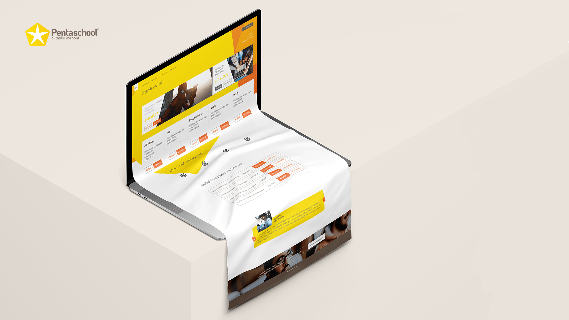
Pentaschool
A case study about redesigning an educational platform and it's service
Overview
Pentaschool is an educational platform that offers a wide range of marketable training courses such as database management, frontend, and backend development, and Excel automation programming training.
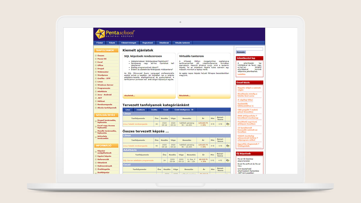
The site was built in the late 2000s, so it was naturally ripe for a redesign. As a result of the project, we also reinvented the way the owners think about their students and services.
SERVICES
UX Research
UX Design
UI Design
ROLE
Product Designer
CLIENT
Pentaschool
Beginning
As a kickoff, we have initiated a stakeholder interview to know more about the company's needs and expectations.
As a next step, We have extended our knowledge about the market via netnography research and competitor analysis.
At this point, we felt prepared to dig deeper and make user interviews to reveal the main problem sources and paint points. Here are the three most characteristic quotes from our interview subjects:
Jakab 24 // Student
"After the C# training, I was able to fit 120 lines of code into 20 lines. I don't understand why they can't teach us that way at the university too."
András 28 // Developer
"... If they’re teaching top-notch technologies, why don't they have a pixel-perfect site as well? I wouldn't register for their courses via that site, because it makes me insecure."
Judit 34 // CFO
"After I completed their controlling training we have booked (the company) another training for our whole department - for 15 people."
Value map
Based on our researches we gathered every aspect we can and created a customer value map that highlighted what we have to work on:

Values
1. Effective and focused courses.
2. Marketable up-to-date skills.
3. Creates a mindset not only a solution.
4. Tailored team courses.

Difficulties
1. The students/employees are too busy to reach out for support if they cannot find any answers to their questions. That may result in a missed oportunity.
2. Everyone registers at the same time - they’re afraid the course won't start. Every course has a minimum required student number to start.
3. Obsolete site design.
Solution
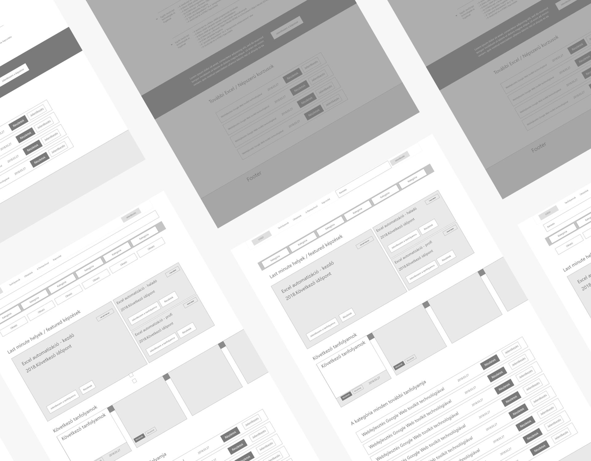
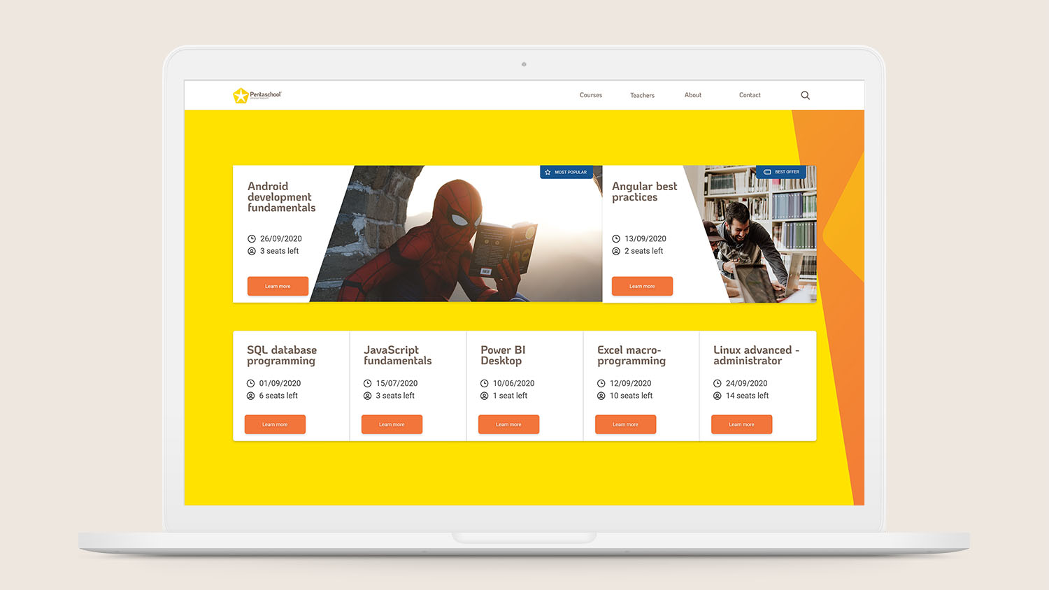
As a next step, we created a sitemap and the main information architecture to start developing the wireframes.
It was pretty straightforward to use and communicated the customer values as main value propositions.
However, we should also focus on creating a fresh, modern, and trustworthy channel where users can find every piece of information about the courses, register, and start the training without any doubts.
Information tiers
We fit every piece of information in a two levels deep hierarchy. However, the new layout still provides an opportunity to reach out to support with questions about the training courses.
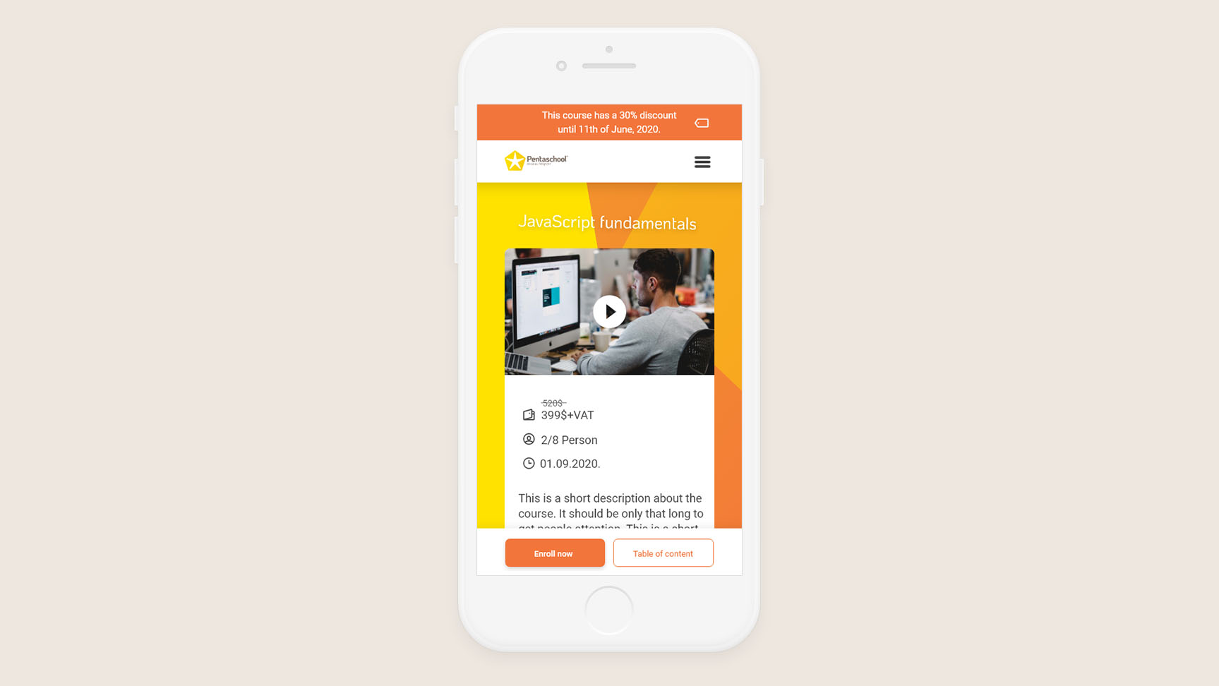
Tier #1: The most necessary pieces of information that are needed to start the course, such as a short introduction to the course, start date, number of participants, and registration button (enroll now). We have committed to fitting all those elements into the above-the-fold section.
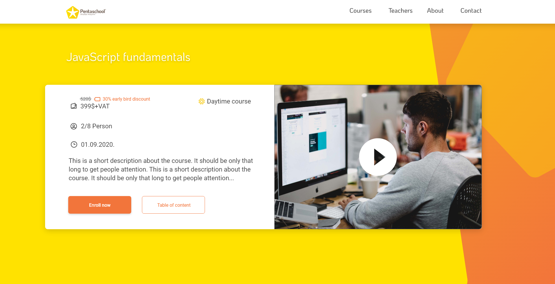
Early adopters
We also suggested giving significant discounts (10-30%) to early registrators to eliminate one of the main problems: the fact that people procrastinate or even totally forget about the training because they are afraid of the course being canceled.
Also, a very effective way to alleviate those doubts: students don't have to pay until the course reached its bottom limit. So we have removed the payment steps from the online registration flow. We made a separate payment flow: an email is sent to every registered student when the limit is reached, which contains payment links and wire transfer steps.
Design renewal
We started to develop our visual language from the company's existing logo and created a mood that we wanted to achieve. We used the main pentagonal shape as a pattern and added warm colors to highlight information. On top of that, we picked KoHo and Roboto fonts for a modern feel and nice readability.

Have you read it ‘til here? Thank you for watching!
Selected Works